

What is "all-cause mortality"?
And why does it matter? A peasant review.

To all the peasants new to this stack, welcome! It’s amazing to have you on board as we flail about this crazy world. And to those who decided to pledge your support, thank you so very much. Be the change right? Let’s do this!
Independent researcher Jessica Hockett recently posted a note about elderly deaths during lockdowns, and this brought back a lot of memories for me as I had become quite obsessed throughout the lunacy in 2020-2021. As an ordinary plebian dummy, terms such as “all-cause mortality” had not entered my mind until that time. One of the earliest voices pointing to this data was Denis Rancourt, who encountered difficulty in having papers published on the topic due to censorship.
The term itself is rather self explanatory, representing a total number of all deaths no matter the underlying cause of death. But who cares? The reason it’s so important is simple: it’s the most reliable dataset you can get, it has the fewest confounders. It’s just how many people died, period. Attributing a cause of death accurately can be difficult, and as we’ve seen with the use of PCR, the purported numbers of “cases” and “covid-related” deaths can be unreliable at best for a variety of reasons. So looking at all-cause mortality trends can be useful in validating whether anything unusual really is happening.
Timeline
For context, let’s recall what the story and its timeline was. We were told in December 2019 that an alleged novel, highly contagious pathogen with a high mortality rate had been identified and was sweeping the world - it was emphasized in an authoritative manner that this was spreading exponentially and that everyone was vulnerable. Another new term then arrived: 2 weeks to flatten the curve. This idea was dispensed in tandem with another key notion dubbed: asymptomatic transmission. These ideas, and indeed the whole story is fraught with many problems, but for the sake of this discussion let’s suspend our disbelief and grant the initial premise.
On March 11 2020, a global pandemic was declared.
Purveyors of this story insist PCR is a gold standard for identifying viruses. Readers of this stack may object to that sentiment, and rightly so. But remember, those who would have you believe this whole story absolutely believe in using PCR in this way. At least they appear to, when it suits the fear they peddle and the control they’re obsessed with. But what about when it doesn’t fit?
Researchers analyzed sewage samples from Spain, Italy and Brazil and found supposed evidence of this pathogen from as far back as March 12 2019 (Archive 1, 2, 3). This is just one of a number of such reports. If you know of an even earlier example than March 2019, please let me know so I can amend this article.
Why does this matter?
As we discuss below, there was no departure from normal mortality trends - until well after the WHO declaration - by which time it should’ve been ravaging the world for at least a whole year, if one is to accept the established premise.
Data
As the story goes, we hear about Wuhan, China, then northern Italy and New York City. Being in Canada, my focus will be on the official data from the Government of Canada and that of its provincial governments. What does this data show, and does it support the story we’ve been told? And what about all the surrounding areas, according to the prevailing paradigm of viral transmission, they must inevitably be impacted? Are they?
Canada all-cause mortality 2014-2024
Statistics Canada provides all-cause mortality here. In case that link gets taken down, see archived version here, here or here.
This is what it currently looks like for 2014-2024:
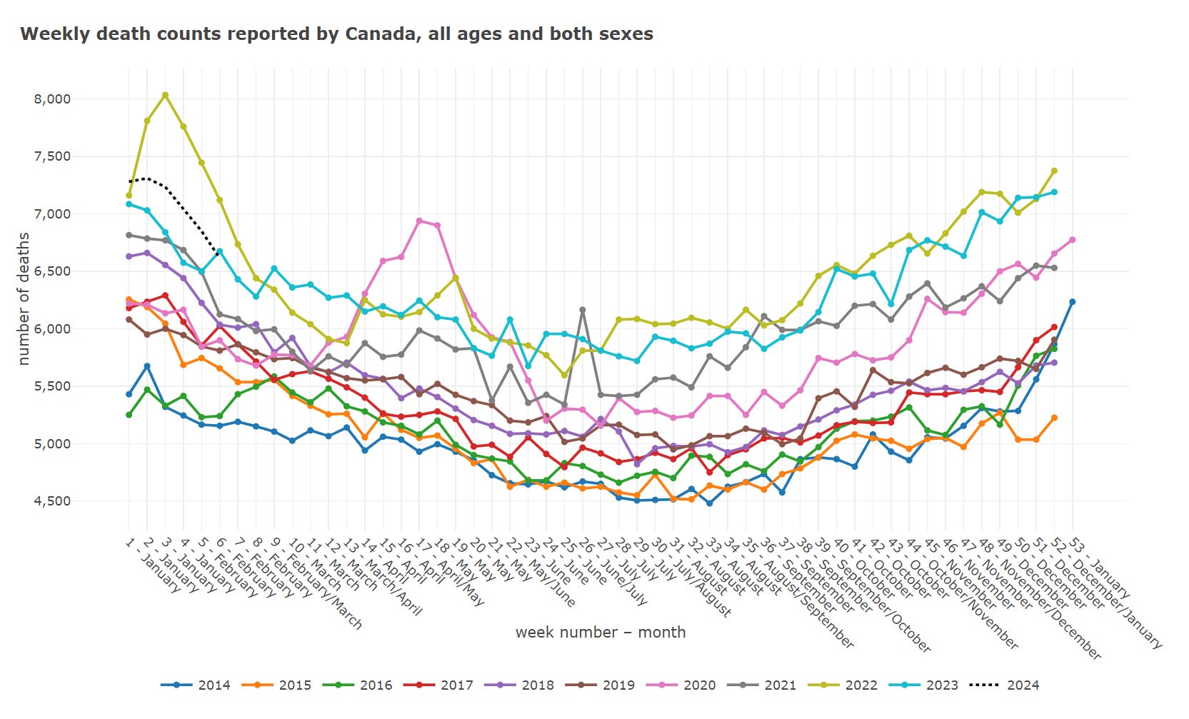
This gives us a broad overview for the entire population. We can immediately see that the number of total deaths has grown steadily each year, with some noteworthy departures from the normal trend. The first thing I’d draw your attention to is the spring 2020 peak. Secondly, notice that even larger early 2022 peak.
Canada all-cause mortality 2020
What happened in 2020? Let’s get a better view:
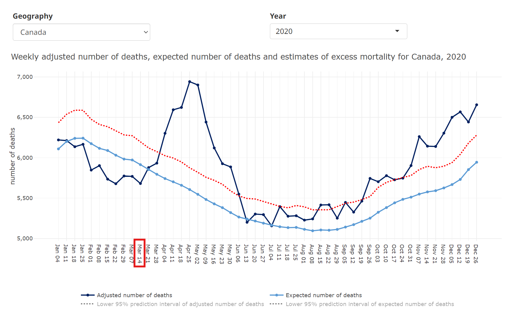
The mortality trend only changed after March 14 2020, a few days after the WHO declaration, returning to normal by June 13 2020.
That also happens to coincide with when many abhorrent mandates and policies were imposed, like:
Denying family members access (Archive 1, 2, 3) to their loved ones
Sending sick people into said facilities (Archive 1, 2)
Stopping nursing home patients from going to the hospital (Archive 1, 2)
They also had many employees refusing to work (Archive 1, 2, 3) in these already under-staffed facilities due to the massive fear campaign:
The home was chronically understaffed, and turnover was high. As the home continued to operate with very little protective equipment after its first identified case, staff began to stay home out of fear, which caused the residents’ needs to be further neglected.
The investigator noted that, at one point, only three staff were available at Residence Herron to care for 133 residents, many of whose basic needs were clearly not met.
Keep all that in mind as we dive into this data.
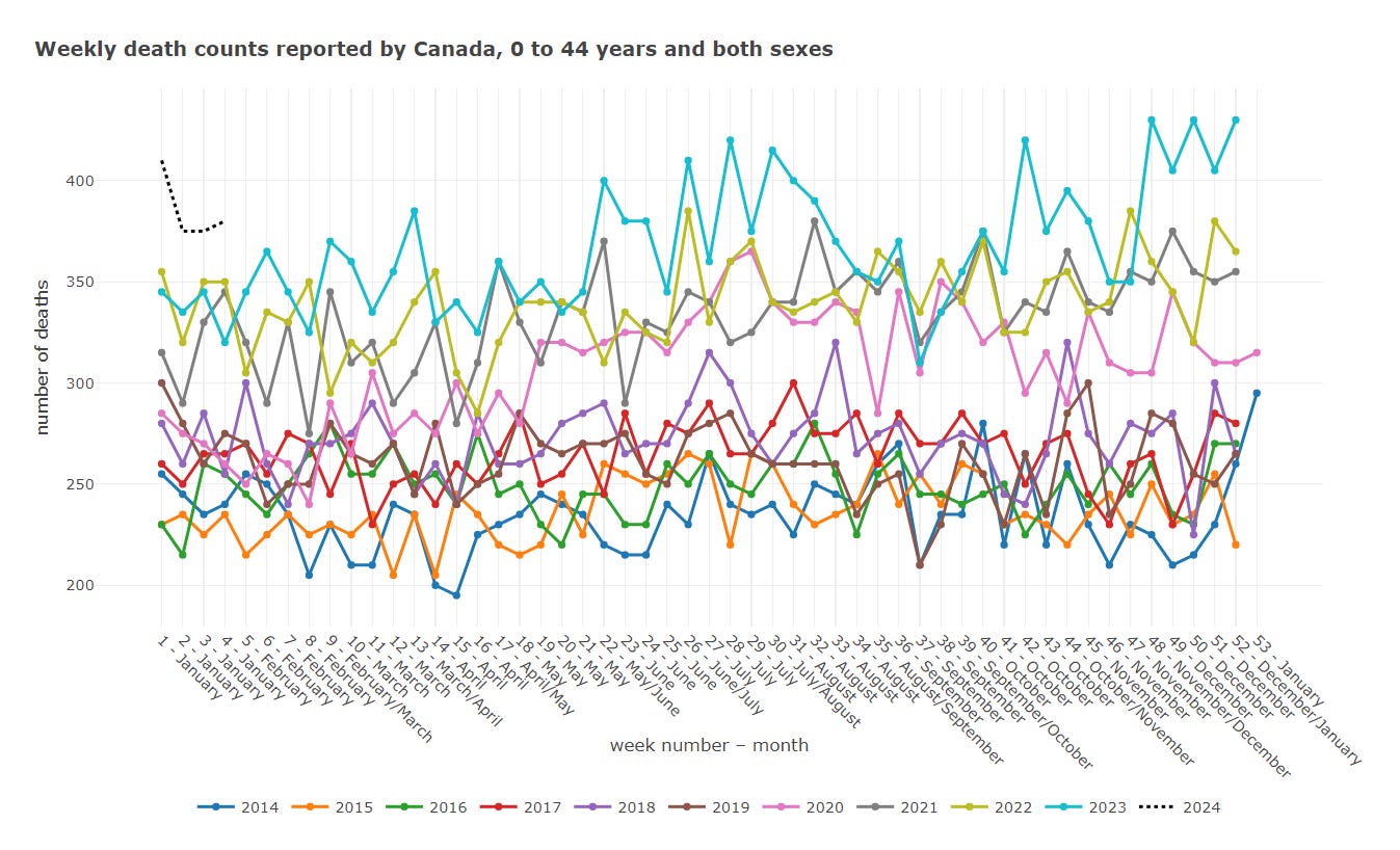
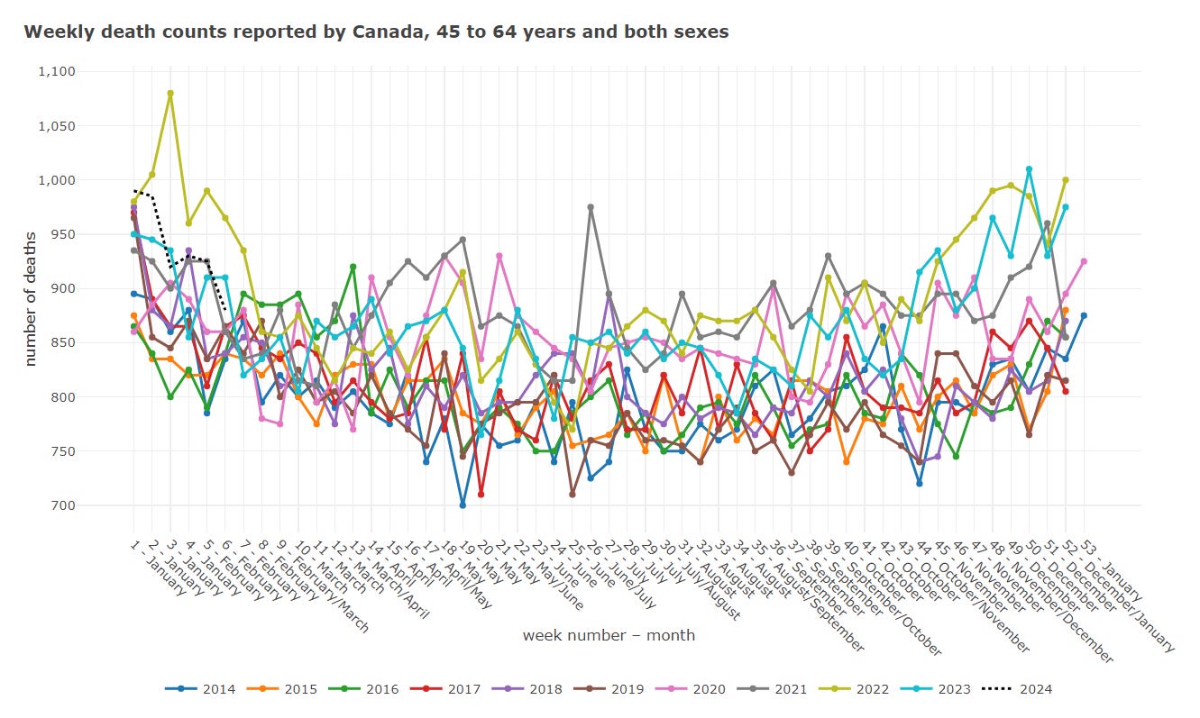
Let’s see how the mortality trends look broken down by age group:
Canada: all-cause mortality 2014-2024 (0-44 years old)
Canada: all-cause mortality 2014-2024 (45-64 years old)
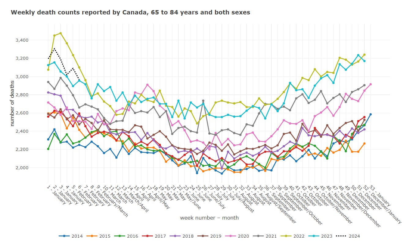
Canada: all-cause mortality 2014-2024 (65-84 years old)
Canada: all-cause mortality 2014-2024 (85+ years old)
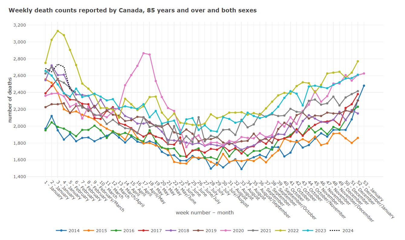
As you can see, the lion’s share of the spring 2020 peak is in the 64-84 and 85+ year old groups. But this is still a high level, nationwide view.
Let’s sort by province, so we can get a bit better visibility into where this took place.
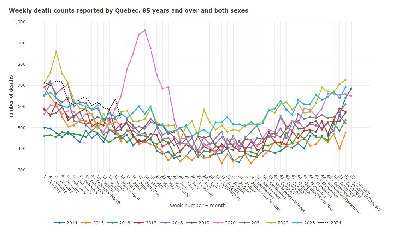
Quebec
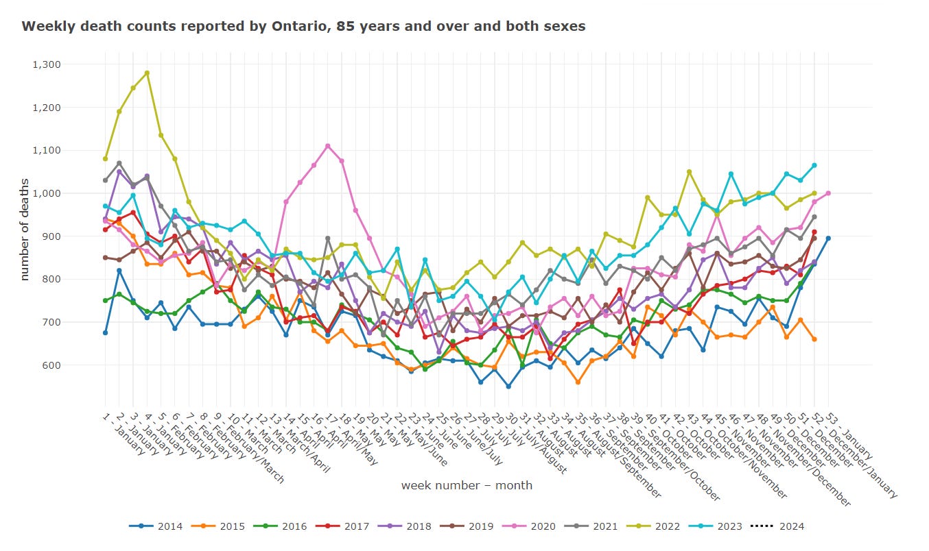
Ontario
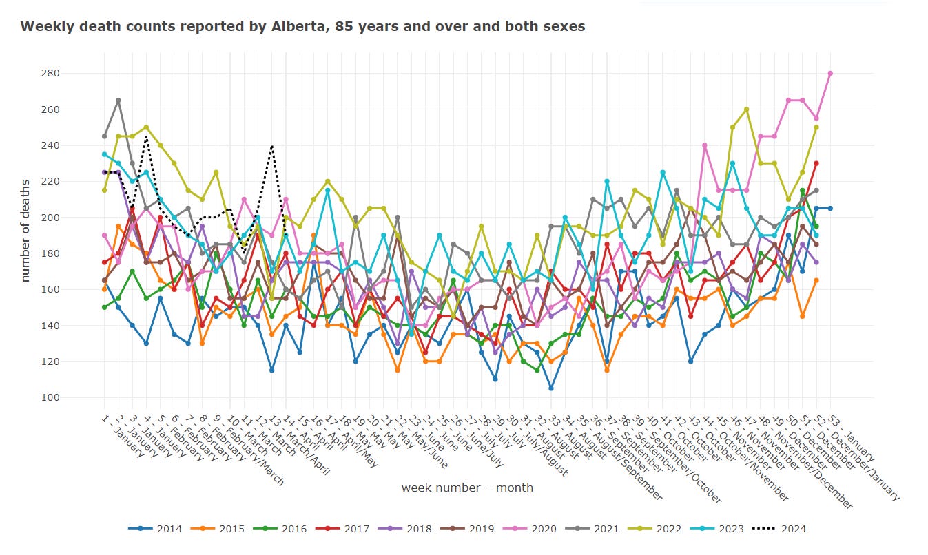
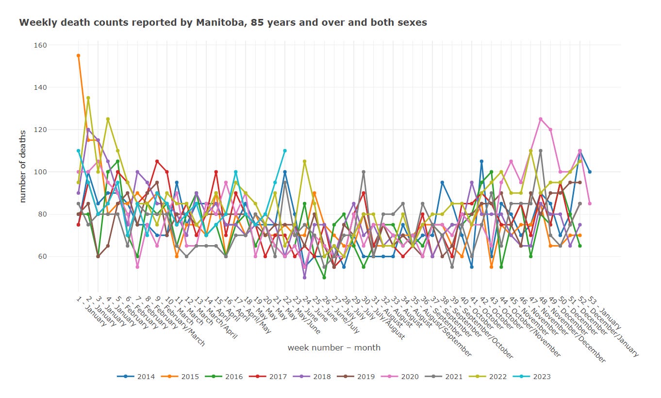
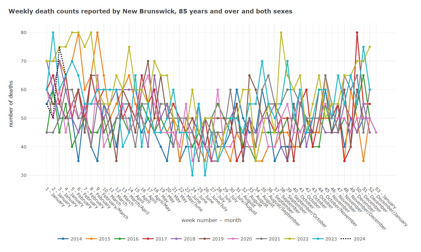
Alberta, Manitoba, New Brunswick
No other Canadian province, not even in the most vulnerable groups, has the spring 2020 peak seen in Quebec and Ontario. Here’s a quick snap of a few other provinces so you can see what I mean:
Quebec: all-cause mortality 2010-2020
What happened in Quebec? Why does it have most of the spring 2020 death?
They have their own provincial government institution equivalent to Statistics Canada called Institut de la statistique du Québec. The used to have an all-cause mortality dashboard posted here, but it has since been taken down.
It is still possible to view an archived version here, here or here.
You can see it features the prominent spring 2020 peak:
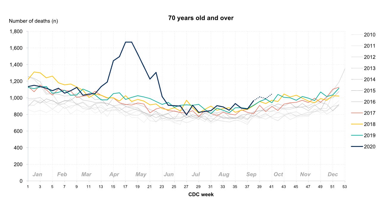
Quebec: all-cause mortality 2010-2020 (70+ years old)
Most of that spring 2020 deaths are indeed in the 70+ years old group:
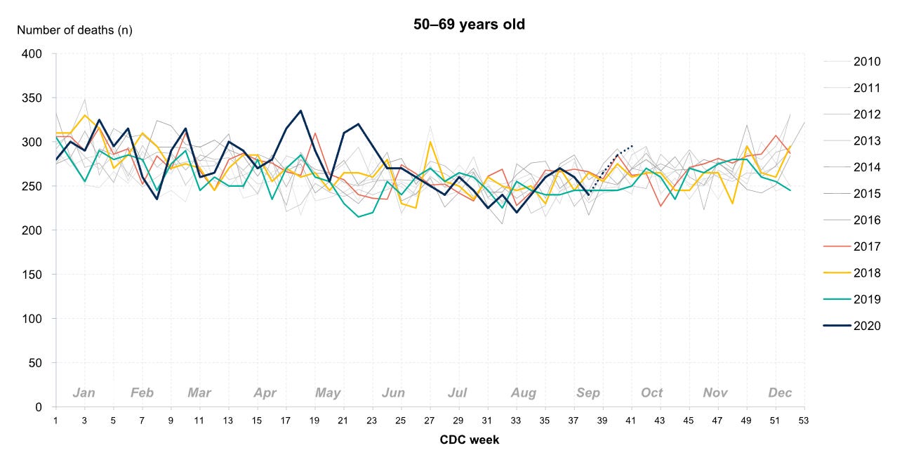
Quebec: all-cause mortality 2010-2020 (50-69 years old)
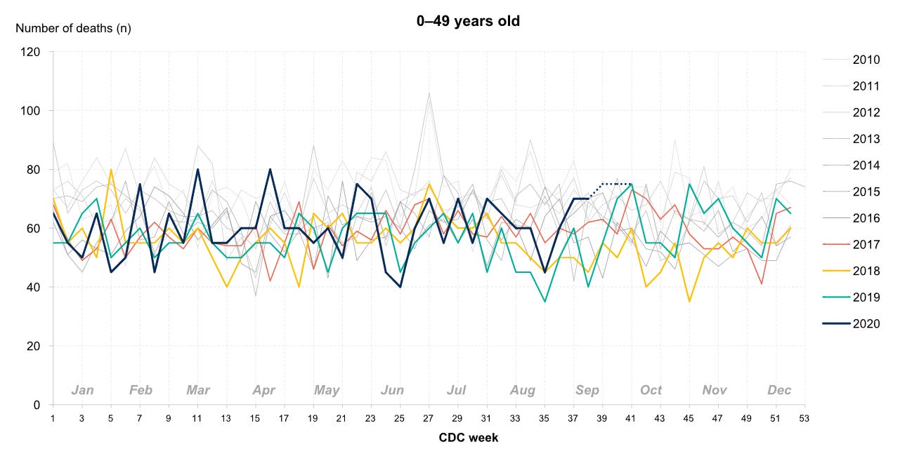
Quebec: all-cause mortality 2010-2020 (0-49 years old)
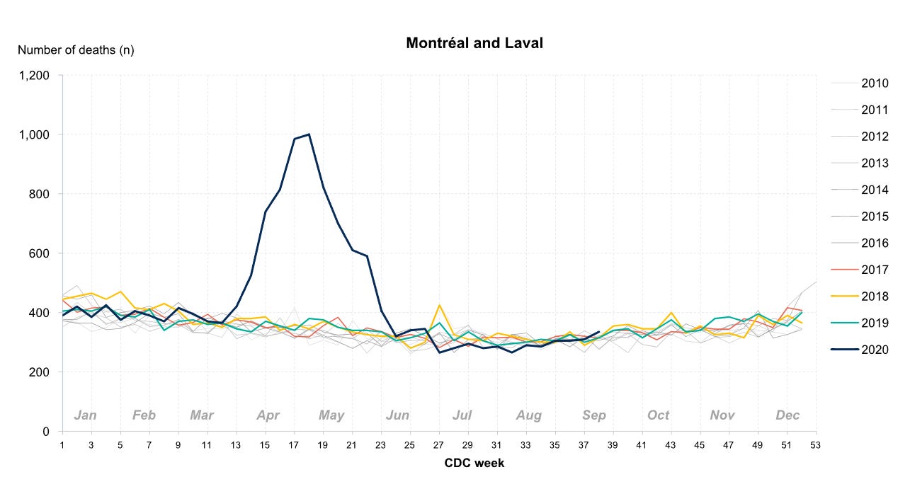
Quebec: all-cause mortality 2010-2020 (Montreal & Laval)
This data shows that a significant proportion of spring 2020 deaths were from these specific regions, Montreal and Laval:
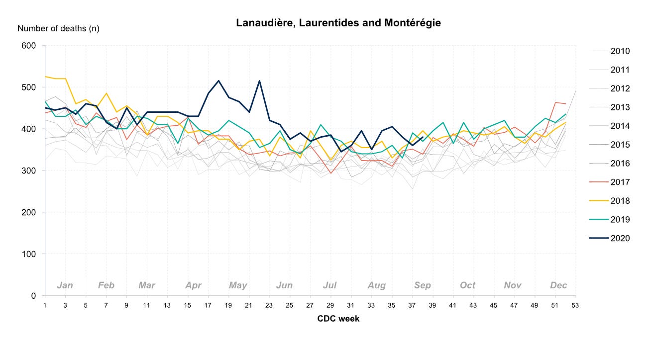
Quebec: all-cause mortality 2010-2020 (Lanaudiere, Laurentides & Monteregie)
To a lesser extent, some of that peak also being from these regions:
Quebec: all-cause mortality 2010-2020 (other regions)
Interestingly, “the virus” was not interested in any other region:
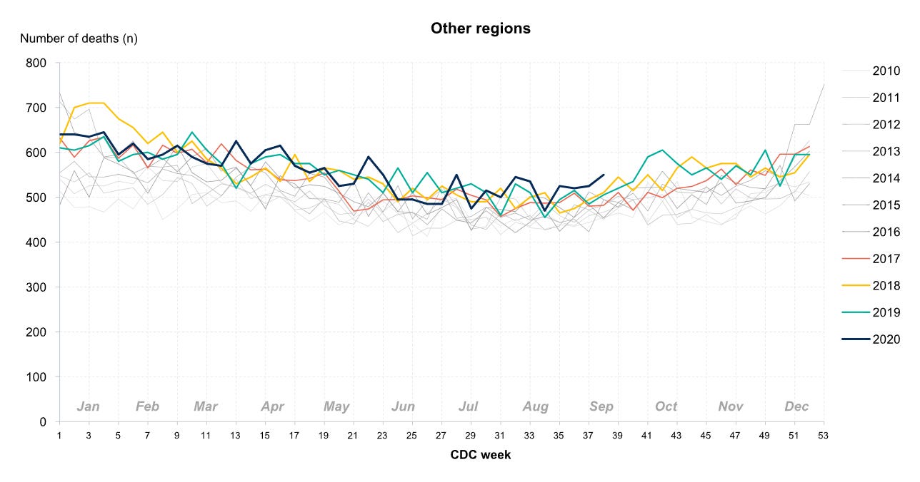
Throughout 2019 and 2020, nothing happened until after the WHO declared a pandemic.
Whatever happened immediately following that declaration happened almost exclusively in a few specific locations.
I’m not telling you what to think. But this is the official data directly from the government. You can click over there and see for yourself, I haven’t changed or manipulated this information in any way.
Ask yourself if their own data supports the story we’ve all been told.
Ask yourself if the data supports the notion that we were “in an emergency” on March 11 2020.
Ask yourself if, somehow that was all justifiable, why even greater death through 2022-2023 is not also an “emergency”.
If you appreciate this information, please share it!